MaterialX Library
MANDATE
Autodesk, having recently acquired the Arnold renderer, made it the default renderer in many of its softwares. One of the main goals with the creation of the MaterialX browser, was to help drive the adoption of Arnold in design and product visualization by offering out of the box, easy to use, open standard materials. These high quality materials and shaders were meant to be DCC (Design Content Creation tool) agnostic, which would easily enable workflows between complex pipelines and preferred DCCs. The material browser was meant to be leveraged by many Autodesk products.
MY CONTRIBUTION
As the only designer on this project, my goal was to come up with a delightful browsing experience that would enable artists to easily find, download and apply materials to their scene. While the short term goal was to support material and texture browsing only, it was meant to become a reusable browser component that could be expanded and built upon by other teams. To ensure that, I instigated many design reviews with key designers across the company to gather feedback, share ideas and ensure that my design would not prevent them from leveraging, and building on top of the component in the future.
DESIGN PROCESS

User Research
User Interface

Design Thinking

UX for VR

Usability Testing
User Flows & Prototyping
Visual Communication

Quantitative Research
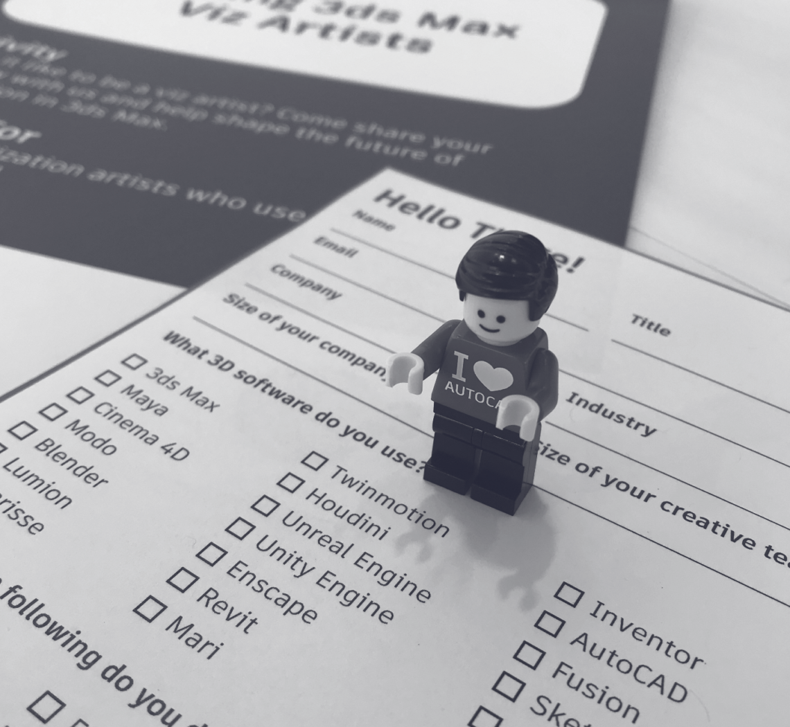
COMPARATIVE ANALYSIS
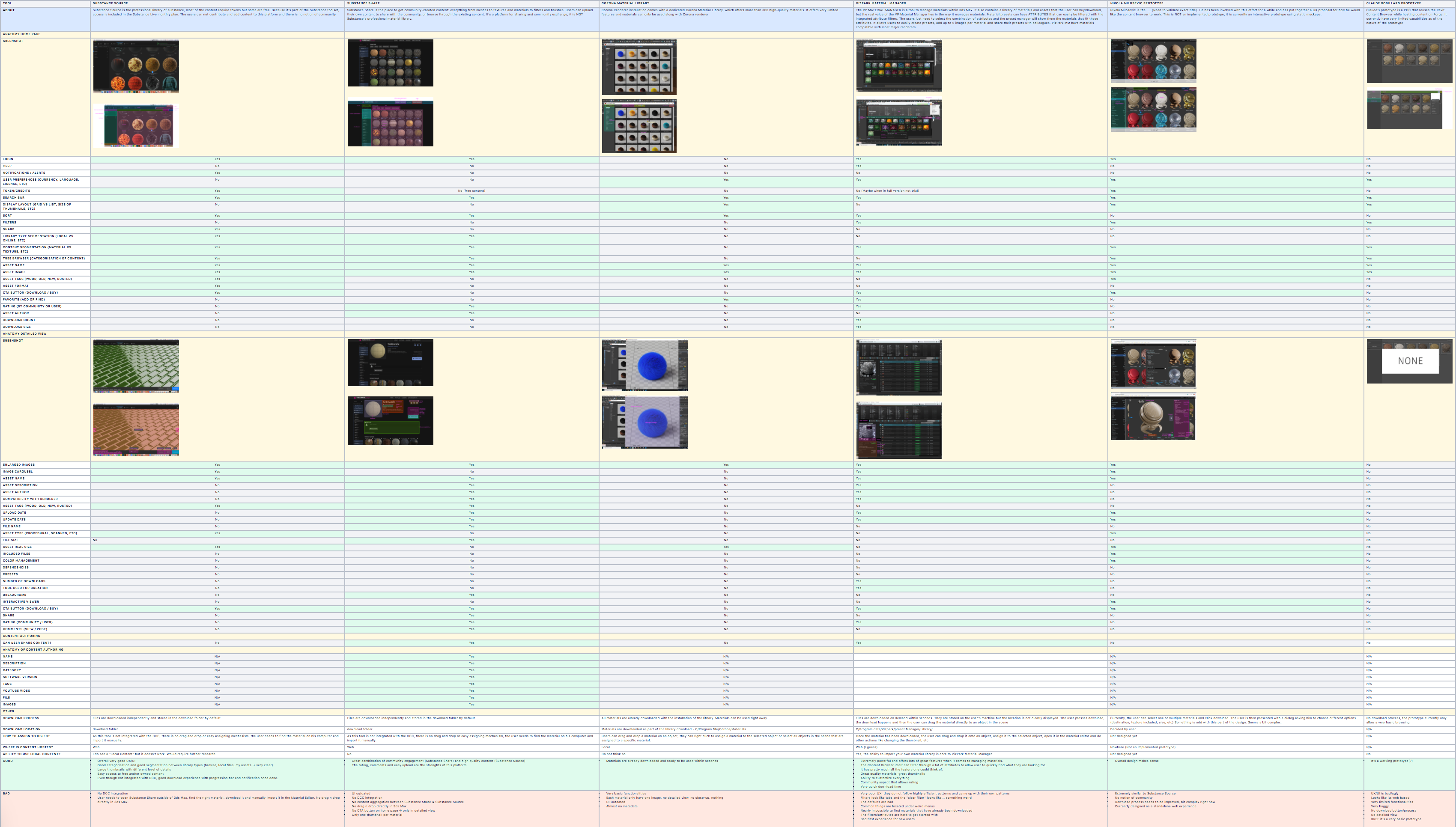
In order to help us define our MVP, I decided to do a comparative analysis of existing material browsers, both internal and external to Autodesk. My primary goal was to gain a better understanding of the typical anatomy and the functionalities supported by material browsers and capture good and bad UX practices.
DEFINITION OF MVP
Informed by the findings of my comparative analysis, the Product Owner, the lead developer and myself started listing all the functionalities that we needed to support to offer a best in class, out-of-the-box browsing experience. We listed and ranked them in order to define what would become our first MVP.

USER FLOWS AND MOCKUPS
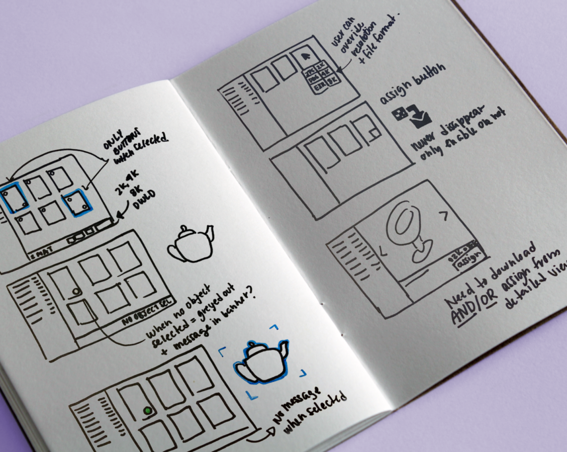
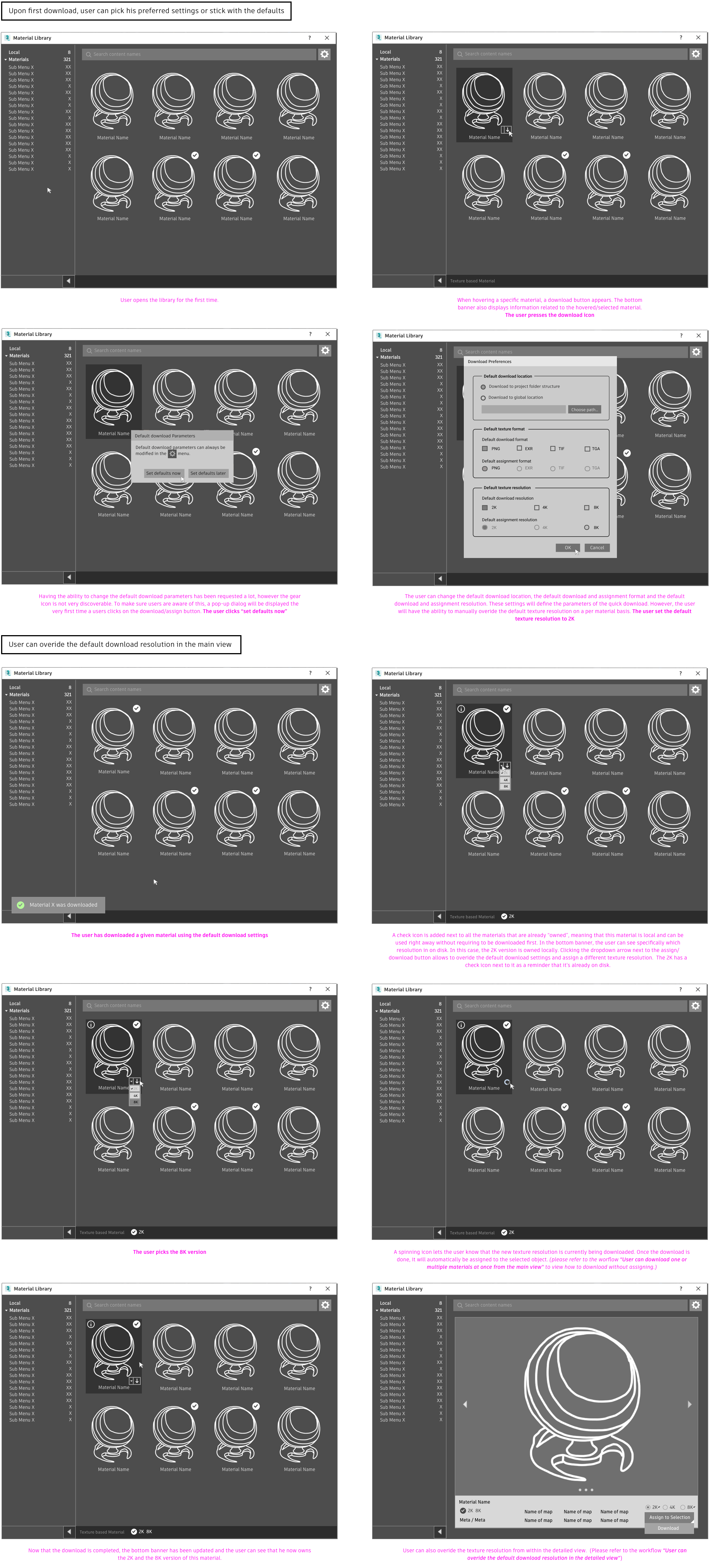
Once the list had been defined and prioritized, I started defining potential user flows, initially using stickies and then using very low fidelity mockups. The flow for each use case were then presented to and challenged by the team.
USABILITY TESTS
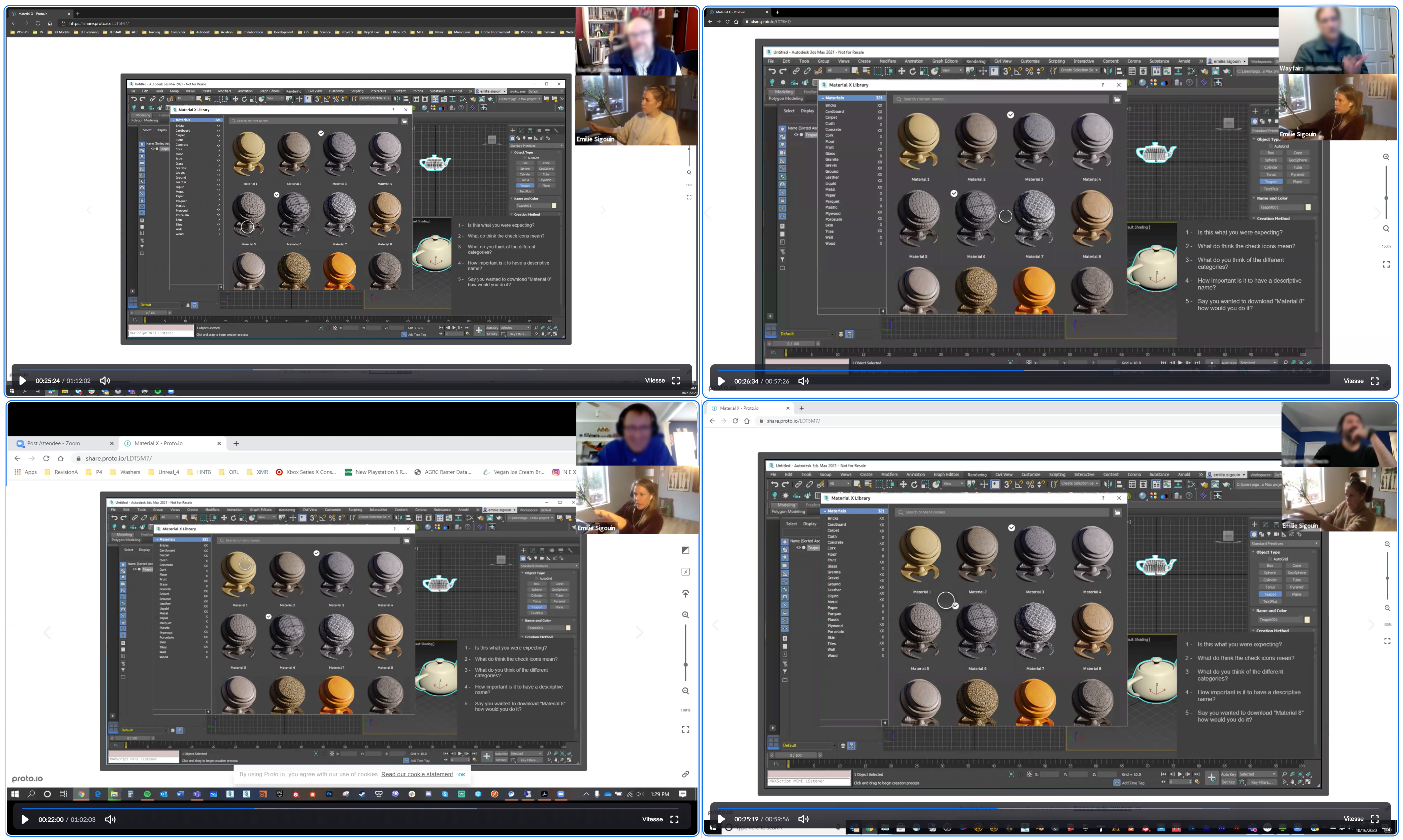
After a few iterations on the UX, based on feedback from my team, I quickly polished the design to make it look less “wireframy” in order to conduct usability tests. My goal was to discover if the user experience was intuitive, if all expected functionalities were supported and if the experience was enjoyable. To do so, I prepared a list of questions that needed validation, I defined the specific scenarios that I wanted each user to go through and I wrote the interview protocol. Finally, I created the interactive prototype using Figma and conducted 5 usability sessions.
REPORT AND ACTIONABLE FEEDBACK
While the design tested very well, we received a lot of feedback related to missing functionalities. In order to share that precious information with the team, I used affinity diagraming to segment the most valuable feedback and ranked each “bucket” based on their importance and level of complexity. This report was then shared and presented to the team, which definitely influenced our roadmap.
EARLY DEMOS
I worked very closely with devs and QAs to make sure that all user facing designs were perfectly implemented. We recorded demos biweekly to share progress with the wider team/division and ensure visibility. In order to make sure that our design could be leveraged by other Autodesk team eventually, I instigated a lot of design review sessions with key designers.
FINAL USER INTERFACE
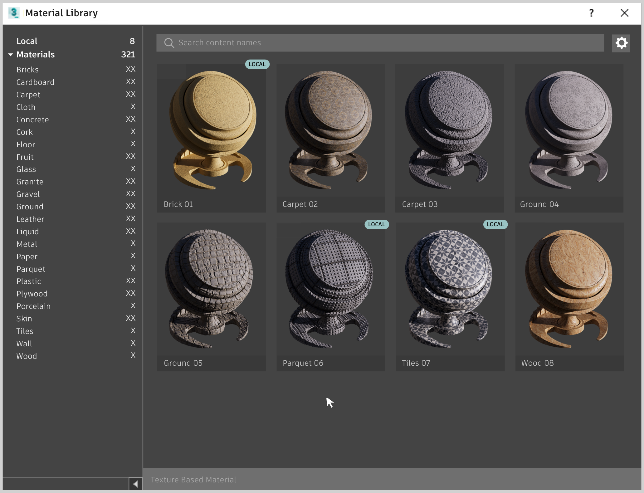
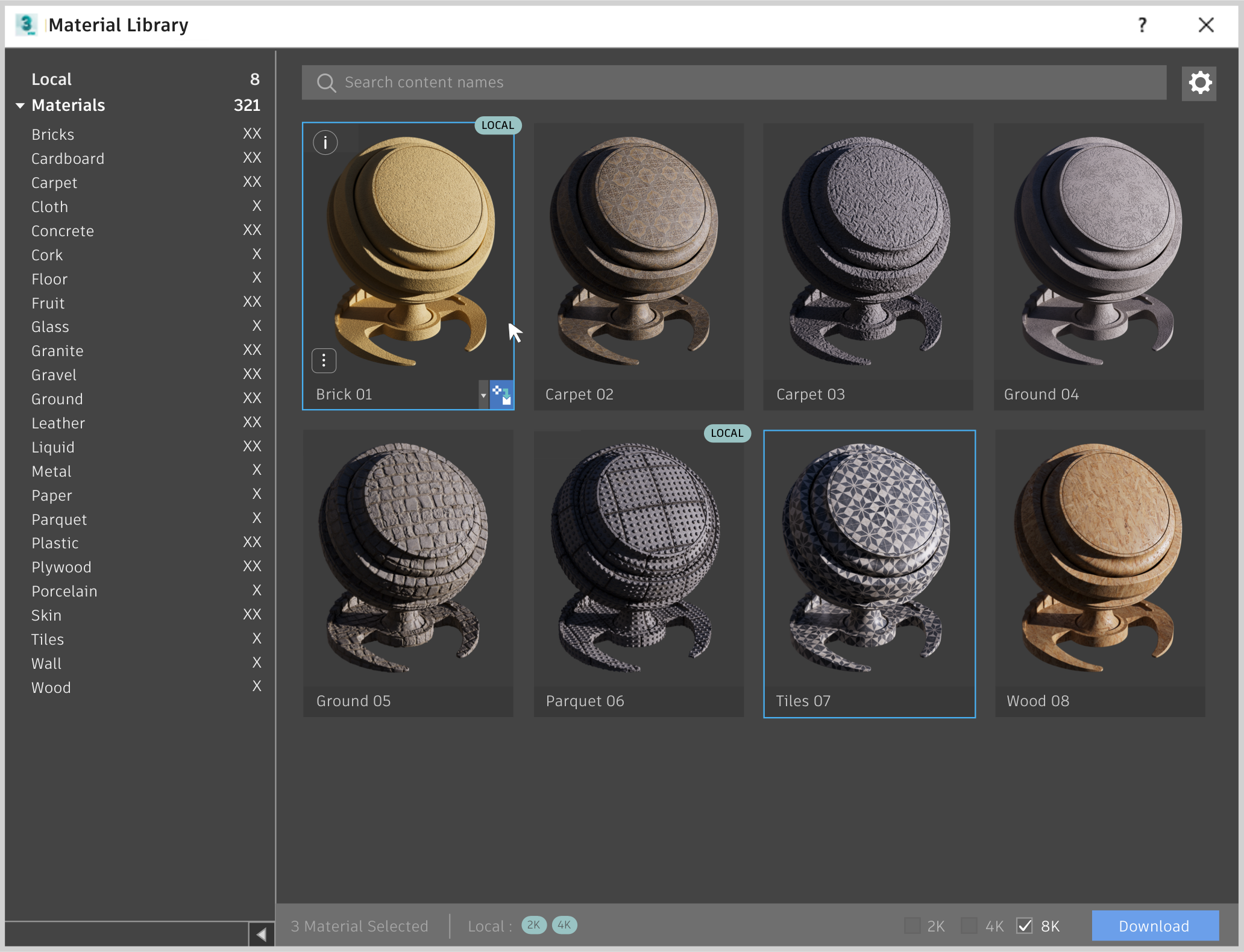
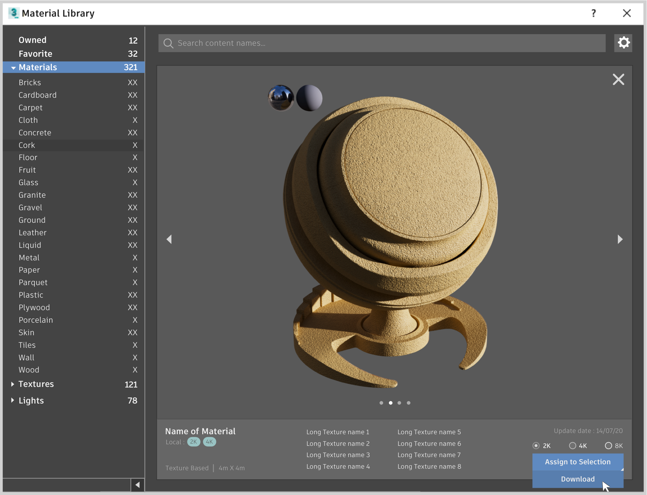
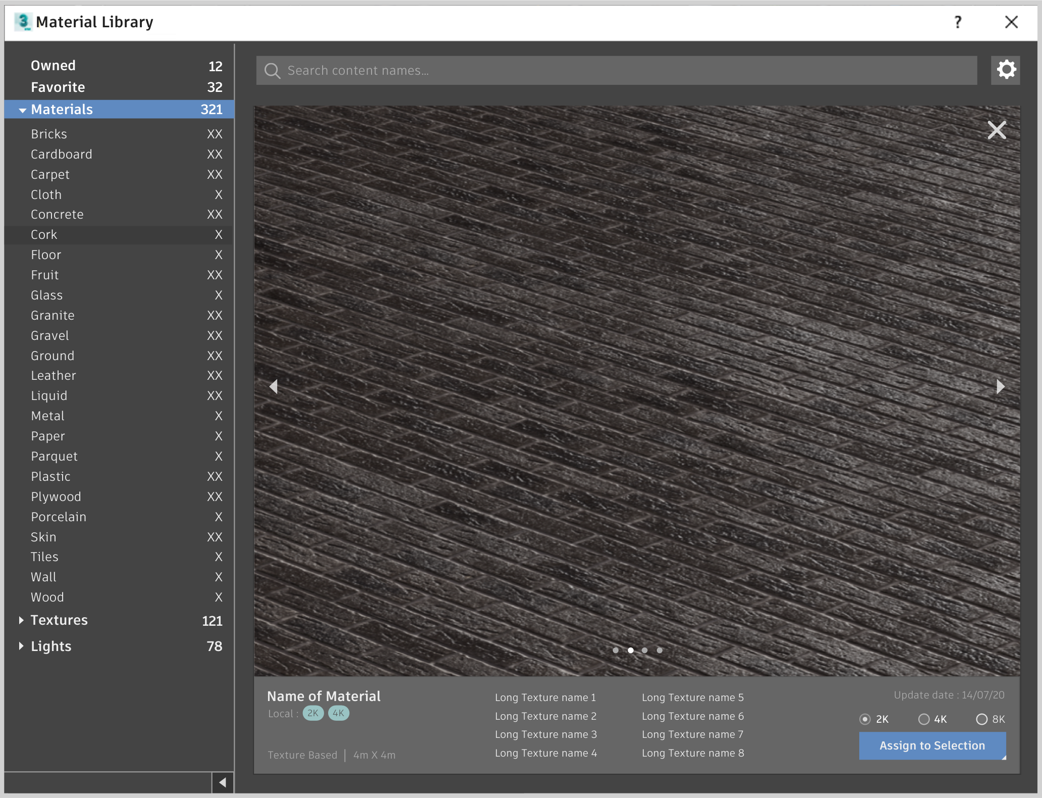
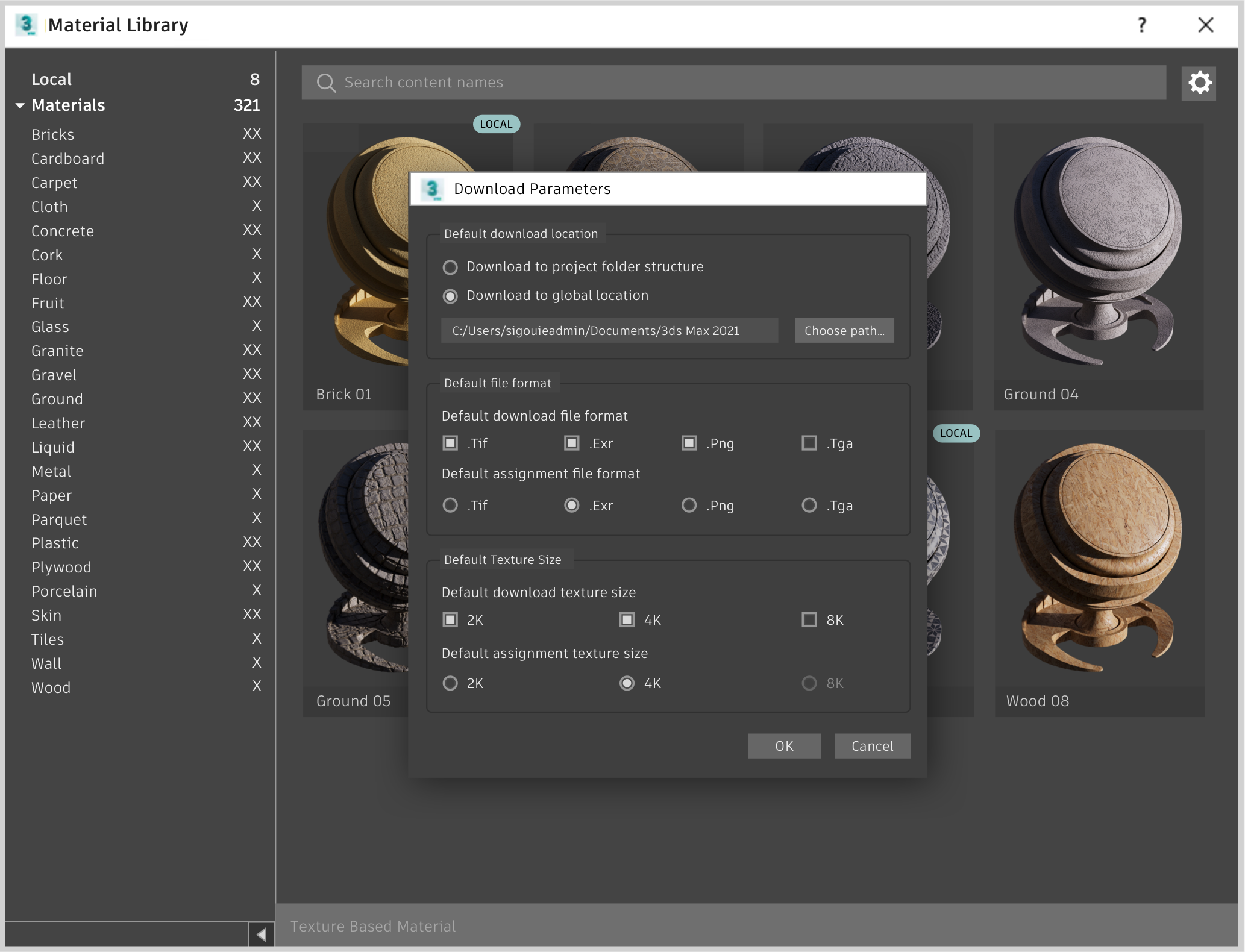
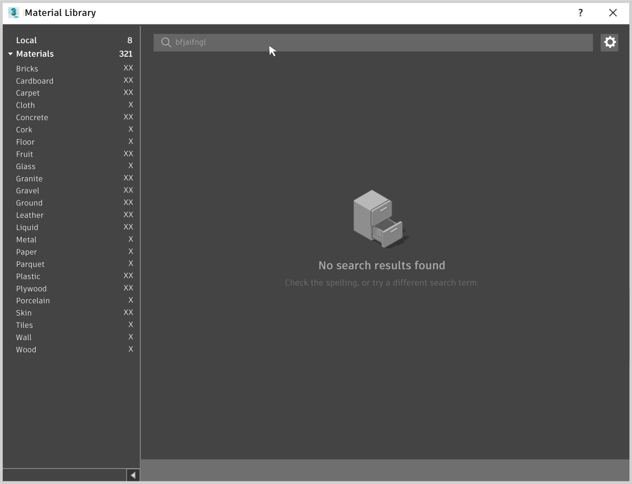
Using a mixture of the styles and components of the Autodesk design system (to ensure consistency across products) and the 3ds Max design system (to ensure that the dialog would feel like it belonged in 3ds Max), I created the user interface for each of the screens and states of the material browser. This design was then presented to my designer peers for design critique sessions.
I CARE ABOUT VISUAL DESIGN, A LOT…
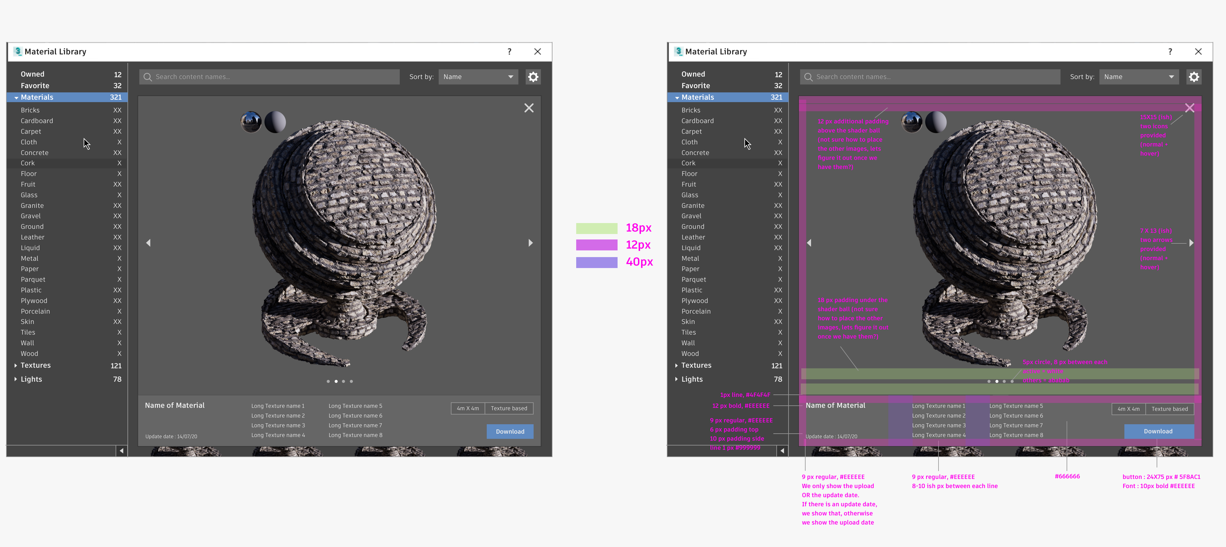
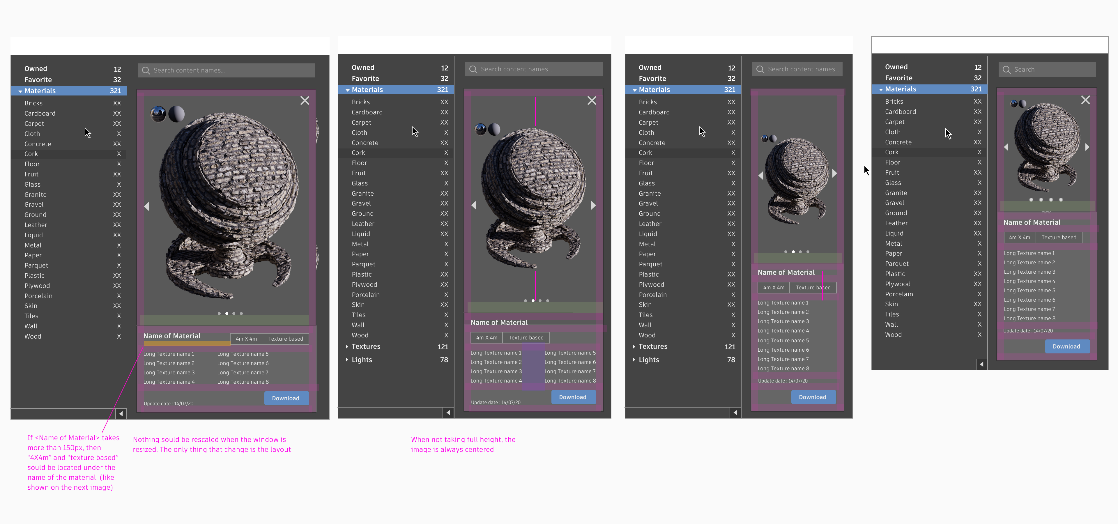
I can be a bit much when it comes to UI and pixel perfect (But not in a way that devs hate me for it!). I’m known for providing mockups with extensive, comprehensive and easy to follow specs.

``Emilie is one of the most effective designer I have ever worked with. Proactive, energetic and totally organized. She's a brilliant and result driven UX designer, always working towards maximal customer satisfaction. Energetic, broad-minded and detail oriented team player, Emilie worked far beyond the call of duty. She is an asset to any organisation.``
``Your skills in developing ideas and presenting them, showing your thought process and being open to feedback has made the design portion of the project very enjoyable. I'm always excited to see your mockups!``
